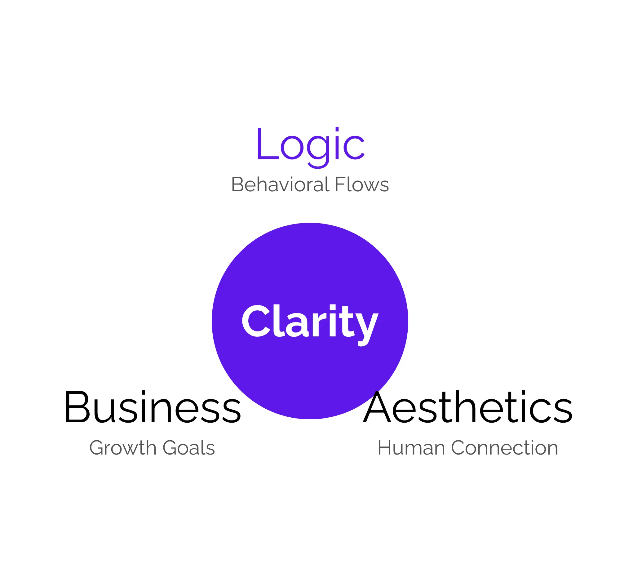
Redesigns that look “modern” but do nothing for conversions are a waste. Most teams focus on visuals, not how people think and act. If users drop off before they complete key actions, the issue isn’t colours. it’s clarity and flow. We start with strategy so your design works, not just looks good.

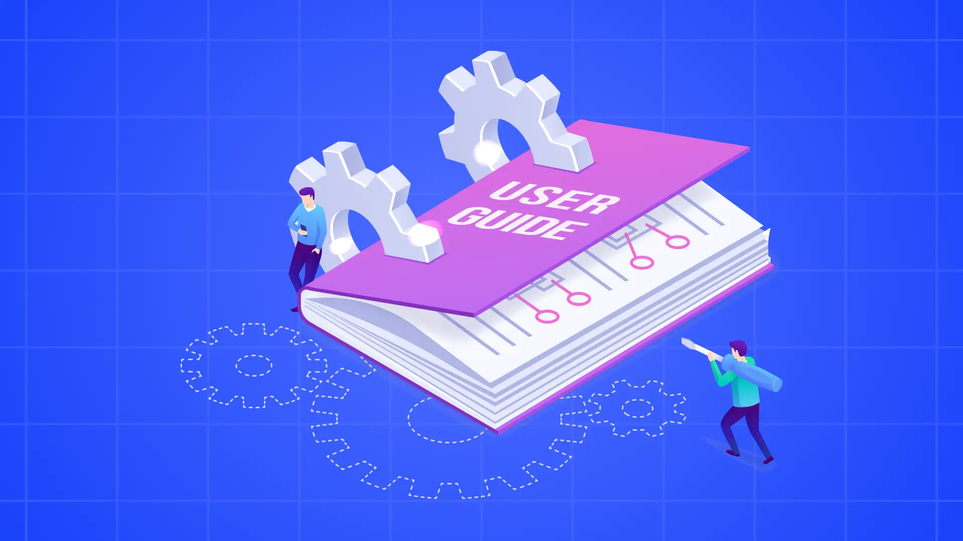
You’ve probably heard “UI/UX” tossed around like a buzzword, but it’s not about trends or flashy visuals. It’s about how people interact, move, and think while using a product, and how design either helps or hinders them.
UX is the full journey users take: Understanding their needs, mapping how they flow through a product, and removing friction so tasks feel intuitive.
UI is the touchpoints they see and click on: Buttons, menus, layouts — the surface that communicates and guides action. In good work, these aren’t separate silos; they’re tightly woven so users complete goals without confusion, hesitation, or bounce.
The Goal
The Mistake
The Risk
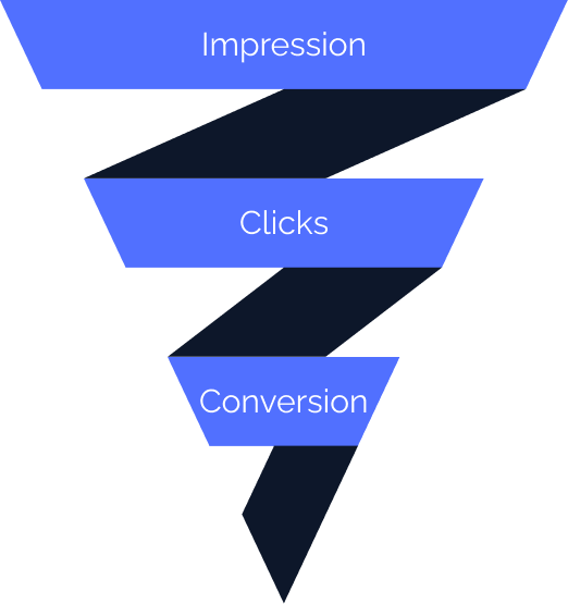
By now, you’ve seen how strategic UI/UX isn’t just about visuals. It’s about clearing the paths users take so they actually complete the actions you built your product for. People leave not because they’re uninterested, but because they hit invisible roadblocks, tiny frictions that add up.
A strong experience doesn’t just feel smooth; it actually keeps people engaged, cuts abandonment, and improves conversion rates — sometimes by multiples. Optimizing UX can lift conversions dramatically, and it also helps keep people coming back instead of bouncing.
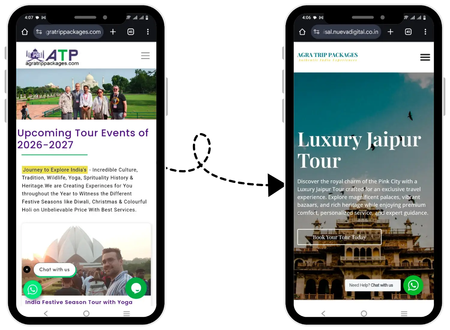
How We Boosted Organic Mobile Traffic for an Agra's School Website?
When users encounter friction at any point in their journey, even for a few seconds, it interrupts their flow and increases the chance they’ll leave and never return. That’s not just lost engagement — it’s lost revenue and longer paths to growth.
Feeling vs. Looking
Good experience design doesn’t just look easier; it feels easier. People stay longer and interact more.
Trust & Outcomes
Users trust more and ultimately convert better when their path feels intuitive and friction-free.
Prioritizing UX means you stop losing users to confusion, frustration, or dead ends — and instead guide them toward the outcomes you designed your product for.
Redesigns often promise better results but rarely deliver the conversion improvements businesses expect. We’ve explored why superficial changes fail to solve underlying problems and examined what truly separates UI from UX.
By now, the common mistakes that plague user experiences are becoming clearer. What’s more important is understanding why these issues extend far beyond aesthetics or personal preferences. When navigation feels confusing, layouts overwhelm users, or calls to action blend into the background, these aren’t just design flaws.
They translate into measurable business losses. Every time a potential customer struggles to find information, hesitates because the interface feels untrustworthy, or abandons their cart out of frustration, it appears in your data.
Cart abandonment rates climb, bounce rates increase, average session duration drops, and conversions stagnate. These metrics tell the real story of what’s happening in the user journey. Recognising how experience problems directly connect to business performance helps identify what genuinely needs attention rather than what simply needs a visual refresh.
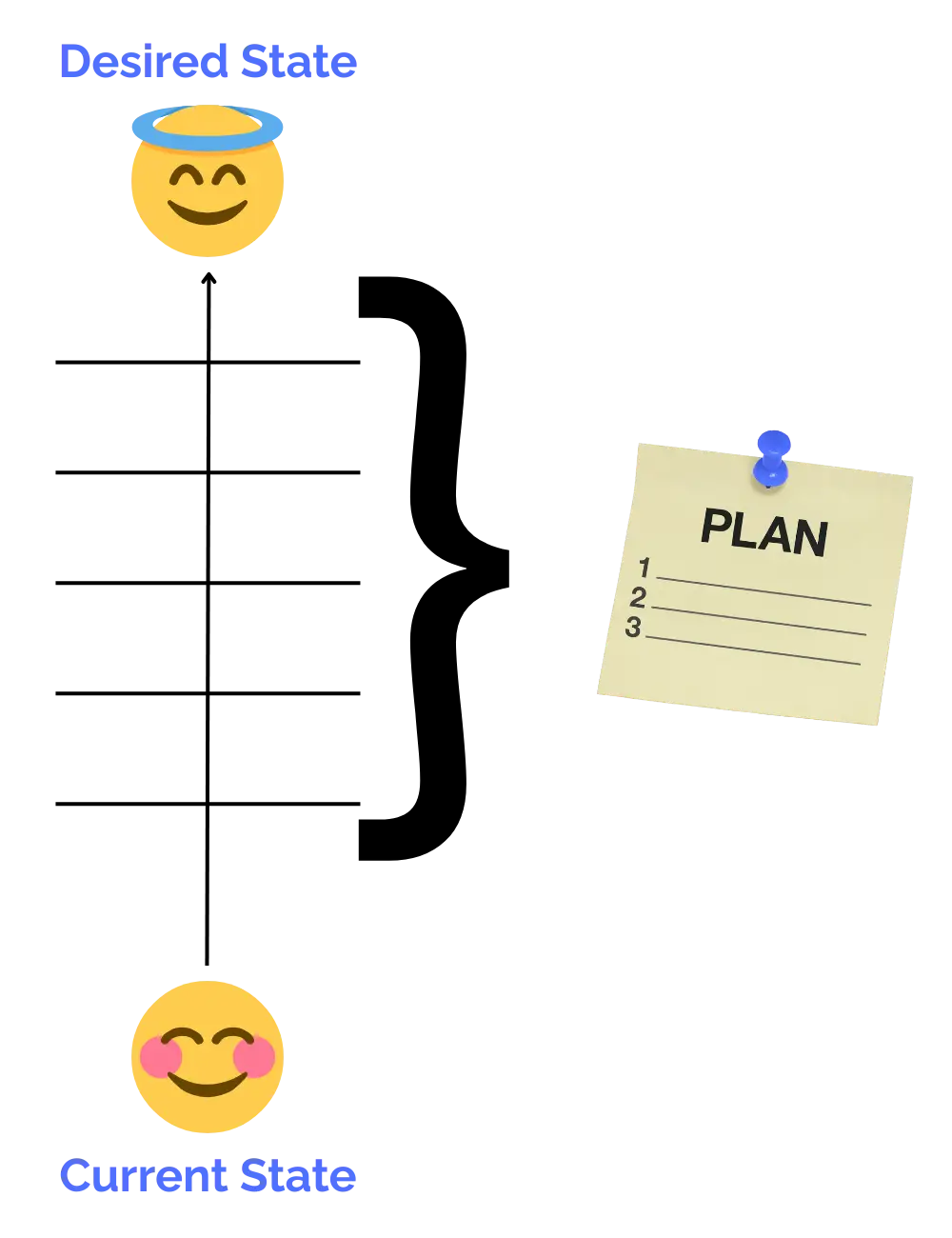
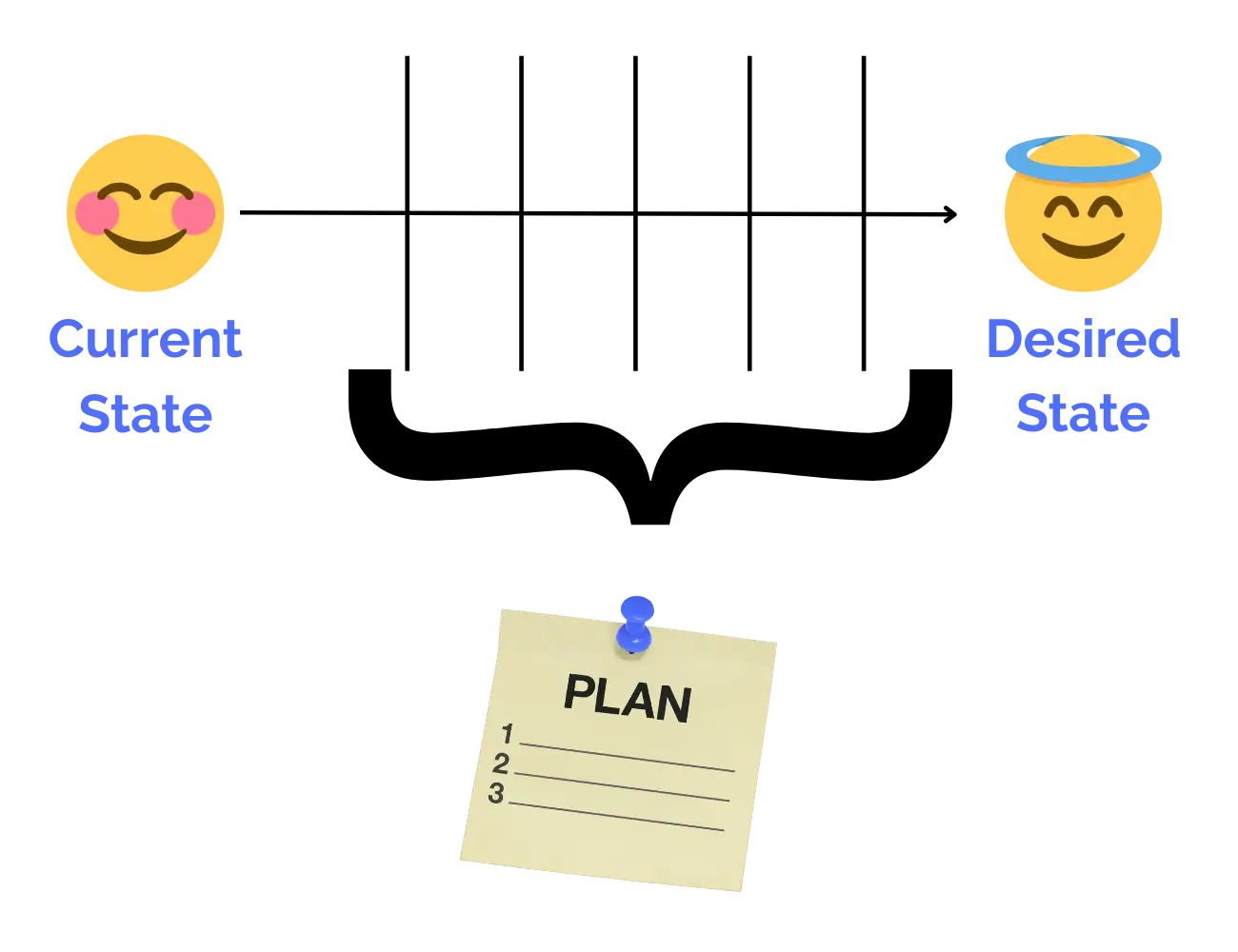
When most people talk about UI/UX “process,” it sounds like a checklist. But good design isn’t linear — it’s strategic, evidence-driven, and iterative. We don’t jump straight to pretty screens. We start from clarity, then build up through research, structure, and testing so every design decision earns its place.
Think of it as a journey: we uncover real user needs, design with purpose, validate with feedback, and refine until the experience not only feels smooth but acts better. Each step informs the next, so nothing is done in isolation — and the outcome feels like progress, not guessing.
1. Understand
Discovery & Research
We start by listening — to analytics, real feedback, and your goals. This isn’t guessing what users want, it’s learning it with data and context so we design solutions that actually matter.
2. Clarify
Define & Strategize
Once we know what’s happening, we define the core experience gaps and opportunities. This becomes the strategic foundation for everything else — no more redesigns that look nice but don’t move numbers.
3. Structure
Wireframing & IA
Before visuals, we map how things flow. It’s like drafting the blueprint before building a house: structure, hierarchy, and paths come first.
4. Prototype
Interactive Concepts
Next we make early, clickable versions. These aren’t polished visuals yet — they’re working ideas you can feel and test so we catch issues long before development starts.
5. Validate
Testing & Feedback
We put prototypes in front of real or representative users, watch how they move, and refine until interactions feel intuitive and purposeful.
6. Polish & Align
UI Design + Development Handoff
Once the experience logic is proven, we refine visuals and work with developers so what ships matches what works.
7. Learn & Improve
Post-Launch Insights
Good UX doesn’t stop at launch. We track performance and tweak so the experience evolves with real use — not assumptions.
Good UX doesn’t stop at launch. We track performance and tweak so the experience evolves with real use — not assumptions.
By now you understand the why: bad experiences lose users, and good ones keep them engaged. Here’s exactly how we help you change that — step by step, page by page, interaction by interaction. Each of these capabilities links to deeper pages where you can explore how we do it in detail.
This is where ideas start to feel real. Instead of static images, you get clickable flows that behave like the actual product will. You can test how interactions work before a single line of code is written — which cuts risk and clarifies requirements early.
Buttons, inputs, transitions, feedback — these might seem small, but they define how people feel about using your product. We design interactions so they’re predictable, satisfying, and aligned with human expectations, not just pretty animations.
Not all pages are equal — especially landing pages, where first impressions and clarity determine whether someone stays or goes. We craft landing interfaces that guide attention with purpose and make the next step obvious, not guesswork.
Design shouldn’t end at visuals — it should translate into working features. We work closely with developers to ensure what’s designed is what gets built, reducing rework and misinterpretation. This alignment keeps help tickets, grammar issues, and guesswork out of the final product.
A refresh that feels new doesn’t fix the underlying experience issues you likely came here about. Our revamp work starts with diagnosing real barriers in your current UX — navigation bottlenecks, broken decision paths, unclear messaging — and rebuilds in a way that improves clarity, flow, and engagement.
Up to this point you’ve seen what we do, but why does it matter in real business terms? Good UI/UX doesn’t just make screens look neat — it turns interaction friction into opportunity. When people can easily find what they’re looking for and complete the actions you want them to take, your key metrics improve: conversion rates go up, engagement increases, and users come back more often. That’s not abstract theory — studies show well-designed user experiences can dramatically boost conversions, retention, and long-term growth.

People form an opinion within seconds of landing on a page. When experiences feel intuitive and clear, users stay longer instead of bouncing.

When design and business goals align from the start, it creates clarity for your team and your users. Instead of hoping for better results, you get a process that:
Screens feel intuitive and purposeful, leading users naturally through your product's value proposition.
Flows crafted specifically to help users complete actions confidently without second-guessing.
Users understand exactly where they are and what to do next, reducing anxiety and abandonment.
We tackle real behavior patterns, not guesses, ensuring long-term usability and scalability.
This kind of alignment turns experiences into predictable outcomes. Clarity in design becomes clarity in results — which means your users spend less time wondering and more time actually doing what your product is built for.
Sometimes strategy sounds good in theory. What really matters is how it plays out in practice — the choices made, the logic behind them, and the impact those choices create. The pieces below reflect work and thinking that focus on user clarity, decision simplicity, and measurable experience improvements.
How a complex financial dashboard was redesigned to reduce friction and improve clarity, user engagement, and task completion — simplifying data without losing depth.
A travel mobile app project focused on reshaping the onboarding and booking flows so users felt confident and guided at every step.

An e-commerce redesign that improved navigation and checkout usability, leading to smoother purchase journeys and measurable lift in conversions.
A clear walkthrough of how to tell a compelling UX case story — from problem framing to outcome narrative — so decisions become transparent and educational.
Breaks down the key elements real case studies use — from problem statements and research to design decisions and results — helping you see design thinking in action.
A practical primer on UX strategy: aligning design with business goals, from research through iteration, so decisions feel purposeful, not random.
Great design is not one-size-fits-all — it’s chosen by teams that want intentional, thoughtful outcomes. If you’re aiming to strengthen user confidence, reduce friction in key paths, and make decisions easier for the people who use your product, this approach naturally supports that. This service fits best with clients who see design as a strategic partner to business goals, not just decoration. It’s about making experiences more purposeful, more understandable, and more aligned with what your users need — and enjoying the progress that creates.

Clarity & Results
Teams focused on clear, measurable improvement in user behavior.

Insight-Driven
Organizations that want decisions backed by insights, not guesswork.

Conversion Focus
Groups looking to strengthen key conversion paths with logic and intent.

Usability First
Products where clarity, flow, and usability matter as much as aesthetics.
True Collaboration
Leaders who value shared understanding across design, dev, and business strategy.
Looking for meaningful progress, not just another design file.
This approach resonates when design isn’t treated as an add-on, but as a strategic step in the product journey — when teams want work that’s meaningful, grounded in real understanding, and built to support both users and business outcomes.
To make your decision easier, here are short, clear answers to some questions we hear often. If you want more detail on any of these, we can walk through them together — just reach out.
UX is about the overall experience — how someone moves, thinks, and completes tasks. UI is about the visual and interactive layer — buttons, screens, layout, and feedback. Together they shape how a product feels and functions.
A well-designed experience leads to clearer paths, less hesitation, and higher engagement. That means people stay longer, complete more actions, and return more often — which supports stronger conversions and user satisfaction overall.
We begin with research and understanding your users and goals, then define strategic priorities, map structure and flows, build prototypes, test them, and refine before final design and implementation.
The more context you share — goals, current analytics, user feedback, and key challenges — the faster we can begin aligning strategy with outcomes. We’ll guide you through what matters most.
Timelines vary with scope and complexity. A focused UX improvement might take a few weeks, while a full strategy + design cycle is generally measured in months. We’ll give you a clear estimate up front.
We focus on strategic design, but we also collaborate closely with development teams so that what’s designed is what eventually ships — helping bridge design intention and real implementation.
Bring thoughtful design and strategy together to make every interaction feel intentional and effortless. Take the next step with a conversation that aligns your goals to clear user paths and measurable outcomes.